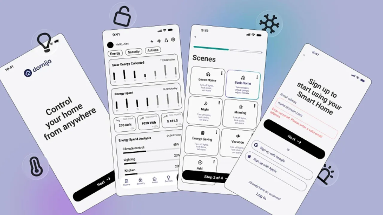
App UX/UI
UX Research · UX/UI Design · Pitch Deck
(Client)
App
(Year)
2025
(Services)
UX/UI

Smart Home App
Iteration1. Video
Smart Home App — Case Summary

Role & Goal
UX Research, UX/UI Design.
Aim: Create a Smart Home app that helps people easily manage multibrand devices in one place, stay secure, and control their home remotely while reducing unnecessary costs.
Key user pains in Smart Home
Cross-brand device complexity – apps often focus on a single brand.
Complex scenes – unclear how they work.
Unclear device status – on/off, is it info button or scenario.
Fear of using devices – worry about breaking or misconfiguring.
Accessibility & ease of use – large buttons, voice control, high contrast.
Assistant – guidance and step-by-step help.
It is not only an AI Assistant. It is a Companion for Personalisation.
Process
Key players analysis (Apple Home, Google Home, Samsung, Alexa, Ecobee)
User research: surveys & interviews.
A Google Forms survey toUnderstand daily usage scenes - morning, night, leave home, back home, vacation, save energy
Identify features users value most - scenes-automations, voice assistant, remote control - smart plugs off, smart allerts.
Reveal obstacles in usability - difficulty configuring and adapting to personal needs, unclear device status, too many steps, notification overload.
User Personas.
User flow.
Emotional journey map.

Design.
Wireframes → Testing → Iteration → Prototypes
Key Insights after 1st iteration
Buttons too small → need clear elements
Terminology of scenes unclear → require explanatory labels
Some scenes confusing → logic should be predictable
Info overload → home screen minimalist
Actionable vs informational items → visually separate
Design Decisions
Onboarding
Optimal cards size + AI search/assistant for accessibility
Dashboard with information/personalization
Simplified energy reports
Security log visible (doors, alarms, leaks)
Improved navigation
All scenes above the fold
Dark and Light modes
Main screen layout
Separation of informational dashboard, scenes, and devices of the main room.
On/off inside cards to reduce unnecessary switching, especially for devices like heating.
Dots added — opens card menu.
Reduced color noise in icons, originally multi-colored.
Familiar devices like AC and lights shown on large cards with buttons.
Technical terms replaced with universal ones, e.g., “Thermostat” → “Heating”.
Main issue
The thermostat was combined (Heating + AC).
Later, because of parallel scenarios (for example, dehumidification or ventilation working at the same time as heating), it was split into two panels.
I would like feedback from technical experts on modern best practices.
Button size for users with good and poor vision.
A small number of real respondents for this case.
Improvements
Panels divided into simpler sections
Reduced the amount of information visible on the home screen
Added visual indicators for key statuses
Ability to “pin” favorite devices or scenarios
Scenes made more understandable
Buttons enlarged, with visual elements for accessing device menus
Added additional visual hints and videos for non-technical users
Room information structured by categories: climate, security, lighting, multimedia
Outcomes
In a small usability session (n=3), participants completed key tasks faster after the redesign. Quantitative validation is planned as a next step.
"Now I can see the buttons — before they were too small to notice."
"I can see which ones I can just switch off, and which ones I shouldn't touch without thinking."
"Now I finally know what's heating and what's the AC."
50% faster completion of simple task like "switch on/off the ligth in the main room" after the second iteration
Next Steps
Devices Screen (limited time for this case)
Behavior analytics
Multilingual modes
Figma file →


Pitch Deck Series B. Simulated


App UX/UI
UX Research · UX/UI Design · Pitch Deck
(Client)
App
(Year)
2025
(Services)
UX/UI
Smart Home App
Iteration1. Video
Smart Home App — Case Summary
Role & Goal
UX Research, UX/UI Design.
Aim: Create a Smart Home app that helps people easily manage multibrand devices in one place, stay secure, and control their home remotely while reducing unnecessary costs.
Key user pains in Smart Home
Cross-brand device complexity – apps often focus on a single brand.
Complex scenes – unclear how they work.
Unclear device status – on/off, is it info button or scenario.
Fear of using devices – worry about breaking or misconfiguring.
Accessibility & ease of use – large buttons, voice control, high contrast.
Assistant – guidance and step-by-step help.
It is not only an AI Assistant. It is a Companion for Personalisation.
Process
Key players analysis (Apple Home, Google Home, Samsung, Alexa, Ecobee)
User research: surveys & interviews.
A Google Forms survey toUnderstand daily usage scenes - morning, night, leave home, back home, vacation, save energy
Identify features users value most - scenes-automations, voice assistant, remote control - smart plugs off, smart allerts.
Reveal obstacles in usability - difficulty configuring and adapting to personal needs, unclear device status, too many steps, notification overload.
User Personas.
User flow.
Emotional journey map.Design.
Wireframes → Testing → Iteration → Prototypes
Key Insights after 1st iteration
Buttons too small → need clear elements
Terminology of scenes unclear → require explanatory labels
Some scenes confusing → logic should be predictable
Info overload → home screen minimalist
Actionable vs informational items → visually separate
Design Decisions
Onboarding
Optimal cards size + AI search/assistant for accessibility
Dashboard with information/personalization
Simplified energy reports
Security log visible (doors, alarms, leaks)
Improved navigation
All scenes above the fold
Dark and Light modes
Main screen layout
Separation of informational dashboard, scenes, and devices of the main room.
On/off inside cards to reduce unnecessary switching, especially for devices like heating.
Dots added — opens card menu.
Reduced color noise in icons, originally multi-colored.
Familiar devices like AC and lights shown on large cards with buttons.
Technical terms replaced with universal ones, e.g., “Thermostat” → “Heating”.
Main issue
The thermostat was combined (Heating + AC).
Later, because of parallel scenarios (for example, dehumidification or ventilation working at the same time as heating), it was split into two panels.
I would like feedback from technical experts on modern best practices.
Button size for users with good and poor vision.
A small number of real respondents for this case.
Improvements
Panels divided into simpler sections
Reduced the amount of information visible on the home screen
Added visual indicators for key statuses
Ability to “pin” favorite devices or scenarios
Scenes made more understandable
Buttons enlarged, with visual elements for accessing device menus
Added additional visual hints and videos for non-technical users
Room information structured by categories: climate, security, lighting, multimedia
Outcomes
In a small usability session (n=3), participants completed key tasks faster after the redesign. Quantitative validation is planned as a next step.
"Now I can see the buttons — before they were too small to notice."
"I can see which ones I can just switch off, and which ones I shouldn't touch without thinking."
"Now I finally know what's heating and what's the AC."
50% faster completion of simple task like "switch on/off the ligth in the main room" after the second iteration
Next Steps
Devices Screen (limited time for this case)
Behavior analytics
Multilingual modes
Figma file →
Pitch Deck Series B. Simulated
App UX/UI
UX Research · UX/UI Design · Pitch Deck
(Client)
App
(Year)
2025
(Services)
UX/UI
Smart Home App
Iteration1. Video
Smart Home App — Case Summary
Role & Goal
UX Research, UX/UI Design.
Aim: Create a Smart Home app that helps people easily manage multibrand devices in one place, stay secure, and control their home remotely while reducing unnecessary costs.
Key user pains in Smart Home
Cross-brand device complexity – apps often focus on a single brand.
Complex scenes – unclear how they work.
Unclear device status – on/off, is it info button or scenario.
Fear of using devices – worry about breaking or misconfiguring.
Accessibility & ease of use – large buttons, voice control, high contrast.
Assistant – guidance and step-by-step help.
It is not only an AI Assistant. It is a Companion for Personalisation.
Process
Key players analysis (Apple Home, Google Home, Samsung, Alexa, Ecobee)
User research: surveys & interviews.
A Google Forms survey toUnderstand daily usage scenes - morning, night, leave home, back home, vacation, save energy
Identify features users value most - scenes-automations, voice assistant, remote control - smart plugs off, smart allerts.
Reveal obstacles in usability - difficulty configuring and adapting to personal needs, unclear device status, too many steps, notification overload.
User Personas.
User flow.
Emotional journey map.Design.
Wireframes → Testing → Iteration → Prototypes
Key Insights after 1st iteration
Buttons too small → need clear elements
Terminology of scenes unclear → require explanatory labels
Some scenes confusing → logic should be predictable
Info overload → home screen minimalist
Actionable vs informational items → visually separate
Design Decisions
Onboarding
Optimal cards size + AI search/assistant for accessibility
Dashboard with information/personalization
Simplified energy reports
Security log visible (doors, alarms, leaks)
Improved navigation
All scenes above the fold
Dark and Light modes
Main screen layout
Separation of informational dashboard, scenes, and devices of the main room.
On/off inside cards to reduce unnecessary switching, especially for devices like heating.
Dots added — opens card menu.
Reduced color noise in icons, originally multi-colored.
Familiar devices like AC and lights shown on large cards with buttons.
Technical terms replaced with universal ones, e.g., “Thermostat” → “Heating”.
Main issue
The thermostat was combined (Heating + AC).
Later, because of parallel scenarios (for example, dehumidification or ventilation working at the same time as heating), it was split into two panels.
I would like feedback from technical experts on modern best practices.
Button size for users with good and poor vision.
A small number of real respondents for this case.
Improvements
Panels divided into simpler sections
Reduced the amount of information visible on the home screen
Added visual indicators for key statuses
Ability to “pin” favorite devices or scenarios
Scenes made more understandable
Buttons enlarged, with visual elements for accessing device menus
Added additional visual hints and videos for non-technical users
Room information structured by categories: climate, security, lighting, multimedia
Outcomes
In a small usability session (n=3), participants completed key tasks faster after the redesign. Quantitative validation is planned as a next step.
"Now I can see the buttons — before they were too small to notice."
"I can see which ones I can just switch off, and which ones I shouldn't touch without thinking."
"Now I finally know what's heating and what's the AC."
50% faster completion of simple task like "switch on/off the ligth in the main room" after the second iteration
Next Steps
Devices Screen (limited time for this case)
Behavior analytics
Multilingual modes
Figma file →
Pitch Deck Series B. Simulated