UX Concept & Logo
The logo represents a user-friendly music application
(Client)
Logo
(Year)
2025
(Services)
Branding

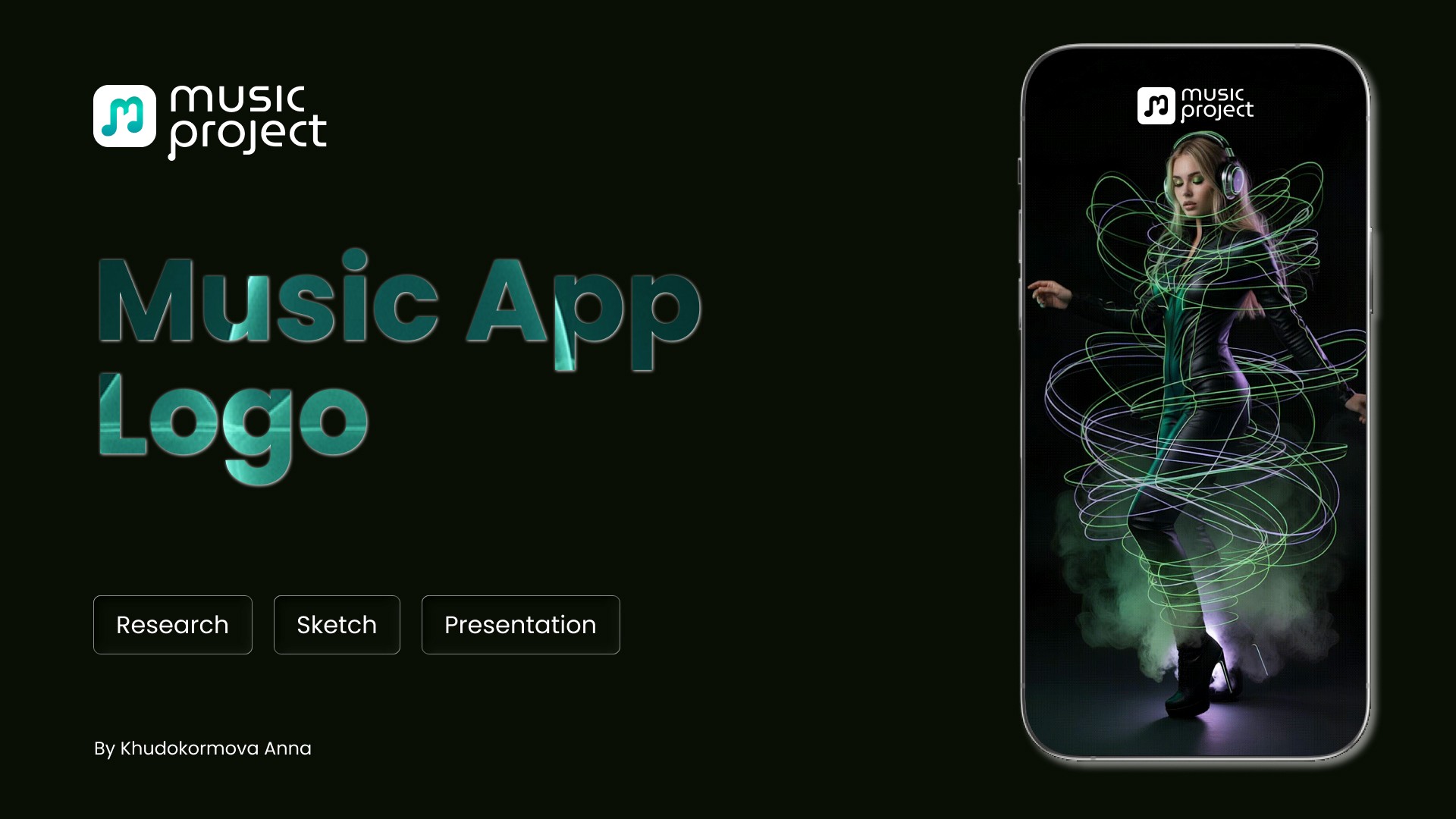
Music Project
UX Concept · Logo Design · Competitor Review
Goal — Music Project app logo.
The task was not only to design a logo for a music app but also to create an icon that would instantly associate with music on the App Store and Google Play.
The product aims to help people quickly find the right tracks — by mood, routine, or genre — offering a wide selection of high-quality, curated music and artists. Musicians, in turn, can access clear insights about their earnings through the app — a true win-win experience.
The logo reflects the brand’s values: convenience, harmony, and clarity.
Brand personality:
Inclusive — 4/5
Rebel — 3/5
Friendly — 5/5
Innovative — 3/5
It avoids extremes and instead conveys a balanced, approachable, and intuitive feel — just like the app itself.
I used Figma to create the logo and moodboard.
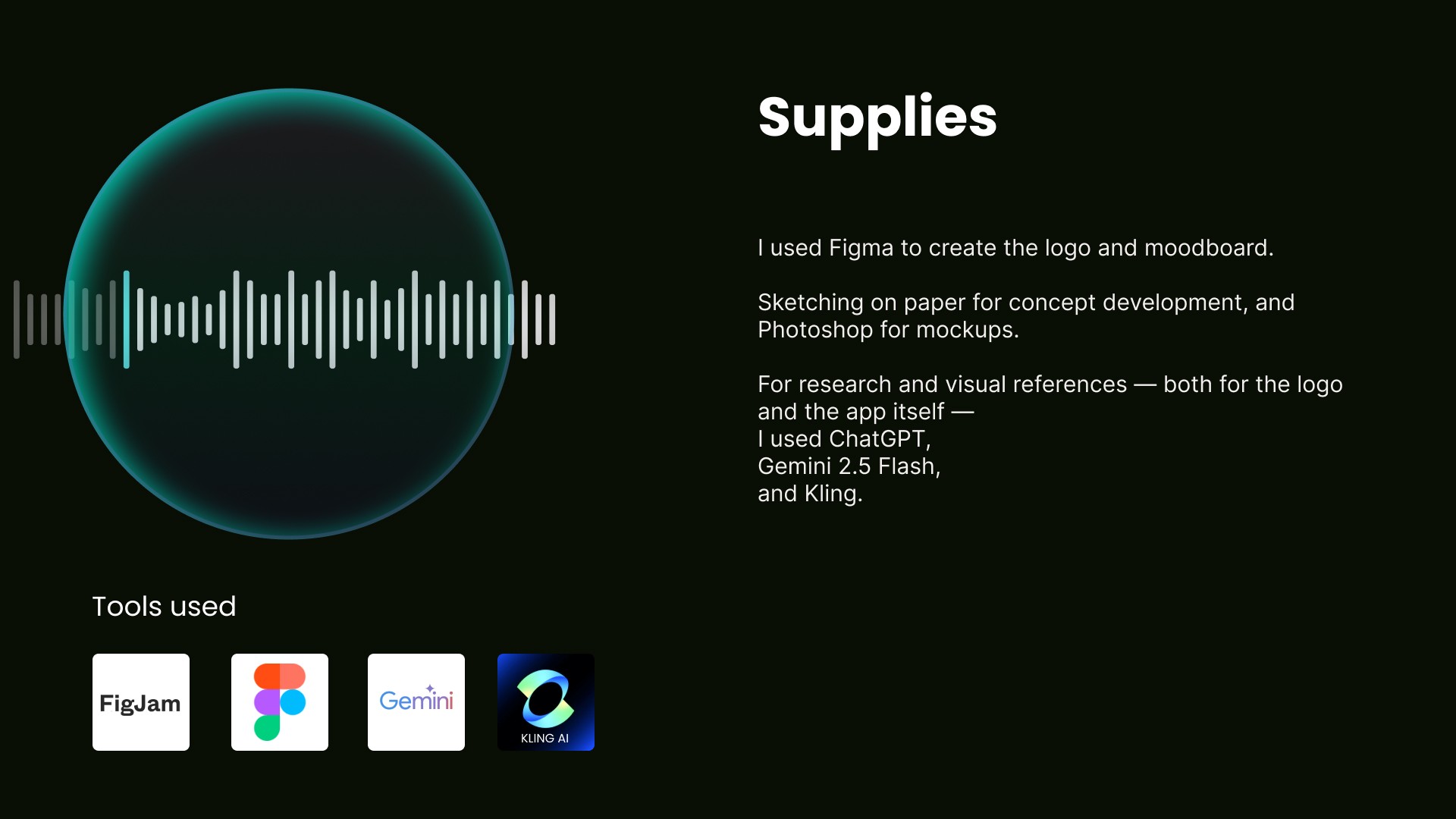
Sketching on paper for concept development, and Photoshop for mockups.
For research and visual references — both for the logo and the app itself — I used ChatGPT, Gemini 2.5 Flash, and Kling.
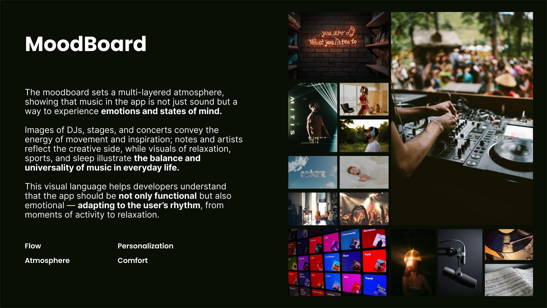
Moodboard for inspiration
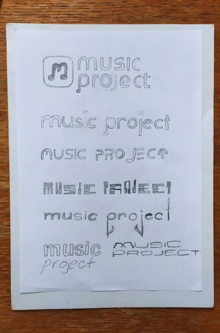
Idea — letters with musical note elements.
Scetch
Idea — letters with musical note elements.
And I remember the task was not only to design a logo for a music app but also to create an icon that would instantly associate with music on the App Store and Google Play.
Logo and icon
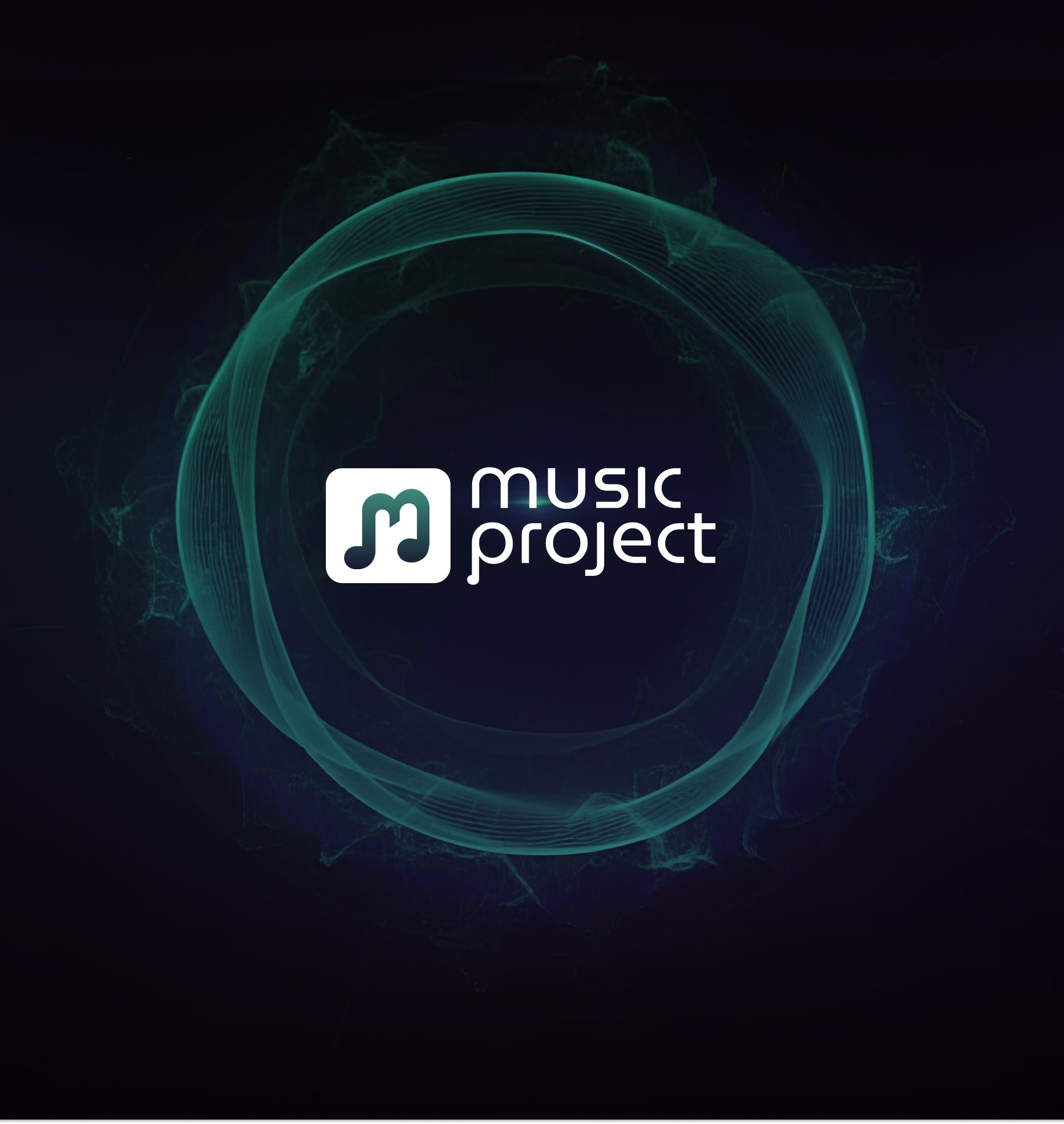
A logo for a music app and an icon reflecting the musical theme, intertwined with the letter P shaped like a note — a rounded, friendly form.
Challenges:
Should the icon be more stylish and modern or more recognizable and music-related for users? I chose recognizability.
Should the note have sharp angles to look more traditional or be rounded to match the letter style? I chose a unified, rounded design.
Should the letters be sharp like the note? No — that would create a rock or “Merry Christmas” vibe.
Should the note have a sense of motion and perspective or stay calm like the letters?
I decided to keep the note dynamic, while the letters remain calm, rounded, and modern — to reflect the app’s friendly and contemporary character.
Thank you for your attention.


UX Concept & Logo
The logo represents a user-friendly music application
(Client)
Logo
(Year)
2025
(Services)
Branding
Music Project
UX Concept · Logo Design · Competitor Review
Goal — Music Project app logo.
The task was not only to design a logo for a music app but also to create an icon that would instantly associate with music on the App Store and Google Play.
The product aims to help people quickly find the right tracks — by mood, routine, or genre — offering a wide selection of high-quality, curated music and artists. Musicians, in turn, can access clear insights about their earnings through the app — a true win-win experience.
The logo reflects the brand’s values: convenience, harmony, and clarity.
Brand personality:
Inclusive — 4/5
Rebel — 3/5
Friendly — 5/5
Innovative — 3/5
It avoids extremes and instead conveys a balanced, approachable, and intuitive feel — just like the app itself.
I used Figma to create the logo and moodboard.
Sketching on paper for concept development, and Photoshop for mockups.
For research and visual references — both for the logo and the app itself — I used ChatGPT, Gemini 2.5 Flash, and Kling.
Moodboard for inspiration
Idea — letters with musical note elements.
Scetch
Idea — letters with musical note elements.
And I remember the task was not only to design a logo for a music app but also to create an icon that would instantly associate with music on the App Store and Google Play.
Logo and icon
A logo for a music app and an icon reflecting the musical theme, intertwined with the letter P shaped like a note — a rounded, friendly form.
Challenges:
Should the icon be more stylish and modern or more recognizable and music-related for users? I chose recognizability.
Should the note have sharp angles to look more traditional or be rounded to match the letter style? I chose a unified, rounded design.
Should the letters be sharp like the note? No — that would create a rock or “Merry Christmas” vibe.
Should the note have a sense of motion and perspective or stay calm like the letters?
I decided to keep the note dynamic, while the letters remain calm, rounded, and modern — to reflect the app’s friendly and contemporary character.
Thank you for your attention.
UX Concept & Logo
The logo represents a user-friendly music application
(Client)
Logo
(Year)
2025
(Services)
Branding
Music Project
UX Concept · Logo Design · Competitor Review
Goal — Music Project app logo.
The task was not only to design a logo for a music app but also to create an icon that would instantly associate with music on the App Store and Google Play.
The product aims to help people quickly find the right tracks — by mood, routine, or genre — offering a wide selection of high-quality, curated music and artists. Musicians, in turn, can access clear insights about their earnings through the app — a true win-win experience.
The logo reflects the brand’s values: convenience, harmony, and clarity.
Brand personality:
Inclusive — 4/5
Rebel — 3/5
Friendly — 5/5
Innovative — 3/5
It avoids extremes and instead conveys a balanced, approachable, and intuitive feel — just like the app itself.
I used Figma to create the logo and moodboard.
Sketching on paper for concept development, and Photoshop for mockups.
For research and visual references — both for the logo and the app itself — I used ChatGPT, Gemini 2.5 Flash, and Kling.
Moodboard for inspiration
Idea — letters with musical note elements.
Scetch
Idea — letters with musical note elements.
And I remember the task was not only to design a logo for a music app but also to create an icon that would instantly associate with music on the App Store and Google Play.
Logo and icon
A logo for a music app and an icon reflecting the musical theme, intertwined with the letter P shaped like a note — a rounded, friendly form.
Challenges:
Should the icon be more stylish and modern or more recognizable and music-related for users? I chose recognizability.
Should the note have sharp angles to look more traditional or be rounded to match the letter style? I chose a unified, rounded design.
Should the letters be sharp like the note? No — that would create a rock or “Merry Christmas” vibe.
Should the note have a sense of motion and perspective or stay calm like the letters?
I decided to keep the note dynamic, while the letters remain calm, rounded, and modern — to reflect the app’s friendly and contemporary character.
Thank you for your attention.